Novelty needs a familiar entry
The product needs enough visual and language context that a first-time visitor can understand it without reading a long explanation.
10 · Food & beverage
A bright, direct-to-consumer food storefront centered on a distinctive garlic-spread proposition.
A flavour-led product storytelling that gives home cooks, hosts, and flavour-seeking food shoppers a clearer route from brand story to the right next action.
Source A-cover not supplied in the project archive.
Brala’s Best brings a distinctive garlic spread to a direct-to-consumer audience. The storefront has to make an unfamiliar product proposition instantly appetising, easy to understand, and simple to buy. The website was shaped to make make a distinctive garlic spread easy to understand, crave, and purchase feel native to the brand rather than bolted onto it.
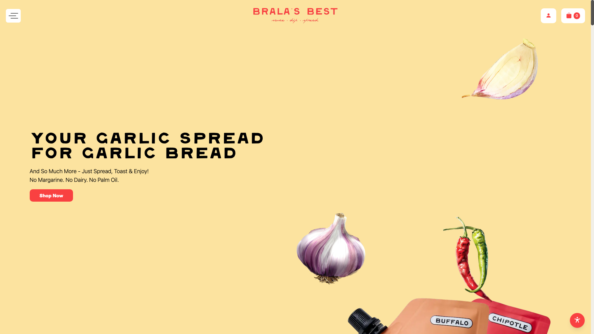 Original desktop storefront capture
A specialised spread may not have an obvious place in every shopper’s routine. The site needed to explain the product’s appeal quickly, translate its personality into appetite, and avoid making the route to purchase feel complicated.
The project archive preserves the engagement type and shipped responsive storefront captures, but not private discovery files, analytics, staffing, duration, or vendor configuration. The observations below describe the documented scope and visible interface—not unpublished client metrics or research claims.
The product needs enough visual and language context that a first-time visitor can understand it without reading a long explanation.
Serving imagery can help shoppers imagine where the product belongs in their own meal or hosting plans.
Once appetite is established, the shopping path should feel obvious rather than requiring more brand education.
The hierarchy was organised around make a distinctive garlic spread easy to understand, crave, and purchase, with the brand story supporting—not competing with—the primary customer decision.
Buttery yellow, garlic imagery, warm food photography, and expressive display type make the brand feel sunny, flavourful, and direct. The aim was a visual language that could flex across campaign, collection, and product moments without losing recognition.
The delivery focused on a responsive Shopify structure that keeps flavour-led product storytelling usable as content, products, and seasonal priorities change.
Defined the storefront’s priority journeys, content hierarchy, and merchandising requirements from the available project brief and brand direction.
Turned the intended brand expression into a clear system of page modules, navigation patterns, and product-storytelling moments before implementation.
Built the storefront around reusable sections, product and collection templates, and responsive layouts suited to day-to-day merchandising.
Tested key viewport states and storefront paths before release. The archive does not preserve the private timeline, launch report, or post-launch optimisation log.
The documented platform is Shopify. The live archive does not name the exact theme, app set, analytics implementation, hosting configuration, or external integrations, so they are intentionally not inferred here.
Garlic-led brand language and imagery make the core offer visible before shoppers have to search for it.
Food photography helps translate a spread into an inviting, practical product rather than an abstract pantry item.
The layout keeps product browsing and purchase movement close to the brand story.
Desktop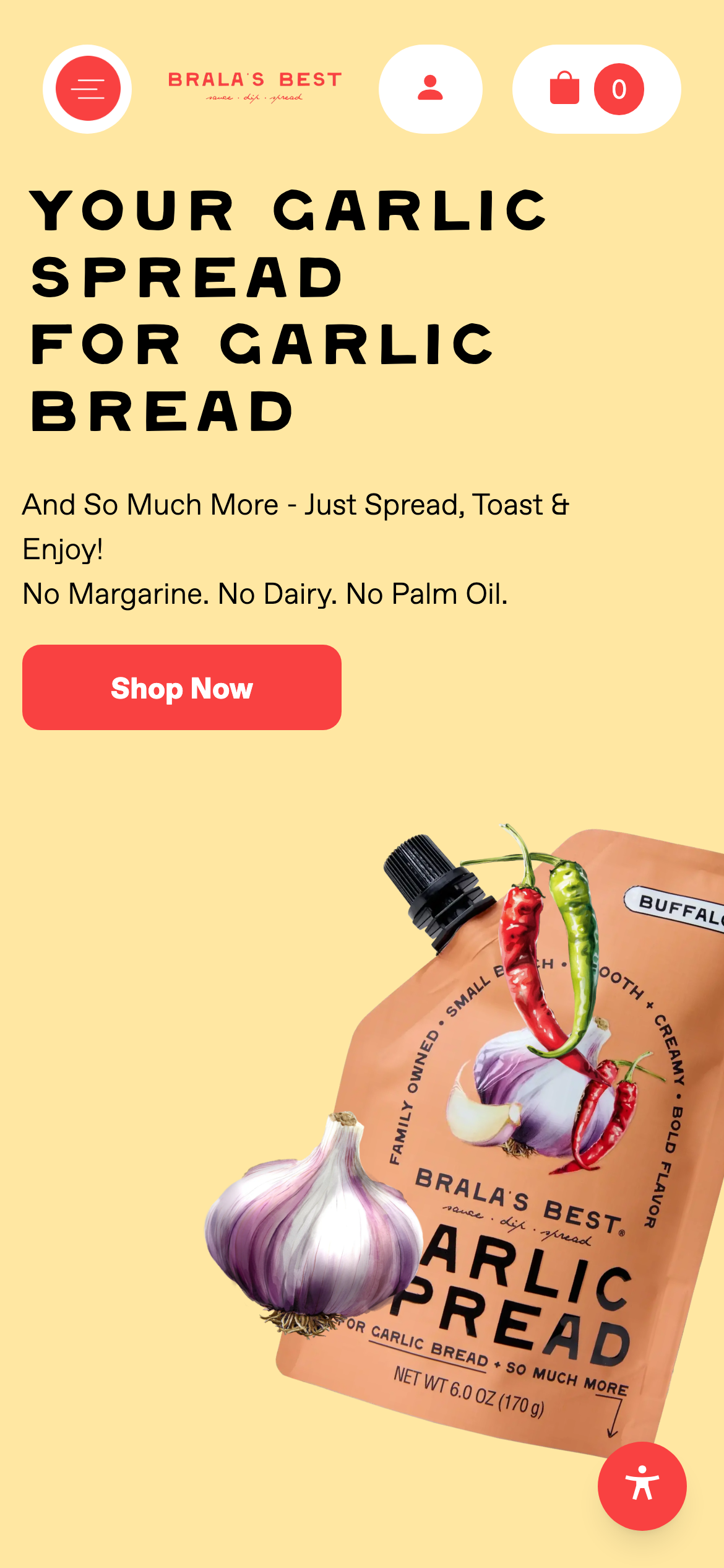 Mobile
Buttery yellow, garlic imagery, warm food photography, and expressive display type make the brand feel sunny, flavourful, and direct. Reusable navigation, promotional, collection, product, and action patterns create continuity across the storefront while allowing campaign content to retain its own energy.
Evidence-aware outcome
The verifiable outcome is a live, responsive Shopify storefront and the documented full shopify build engagement. make a distinctive garlic spread easy to understand, crave, and purchase is given a more deliberate interface path, and the original desktop and mobile captures demonstrate the delivered visual system. Conversion, revenue, engagement, accessibility, and performance metrics were not supplied for this archive and are therefore unavailable.
The project turns a specialised spread may not have an obvious place in every shopper’s routine. the site needed to explain the product’s appeal quickly, translate its personality into appetite, and avoid making the route to purchase feel complicated. into a storefront centred on flavour-led product storytelling. It gives the brand a more coherent way to present its offer while giving customers a clearer path to continue, explore, or purchase.