Trust has to arrive before purchase
Professional-service shoppers need to understand the source’s authority and relevance before they can confidently evaluate a resource.
11 · Professional services
A commerce-led legal resource platform balancing expert authority, education, and product discovery.
A trust-building resource commerce that gives creative business owners looking for legal resources a clearer route from brand story to the right next action.
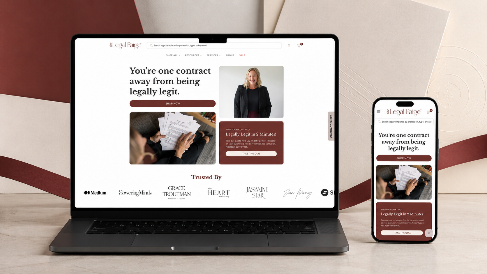
The Legal Paige makes legal resources more approachable for creative and small-business audiences. The storefront needed to communicate expertise and trust while still making templates, education, and offers easy to find. The website was shaped to make make expert legal support feel approachable and easy to explore feel native to the brand rather than bolted onto it.
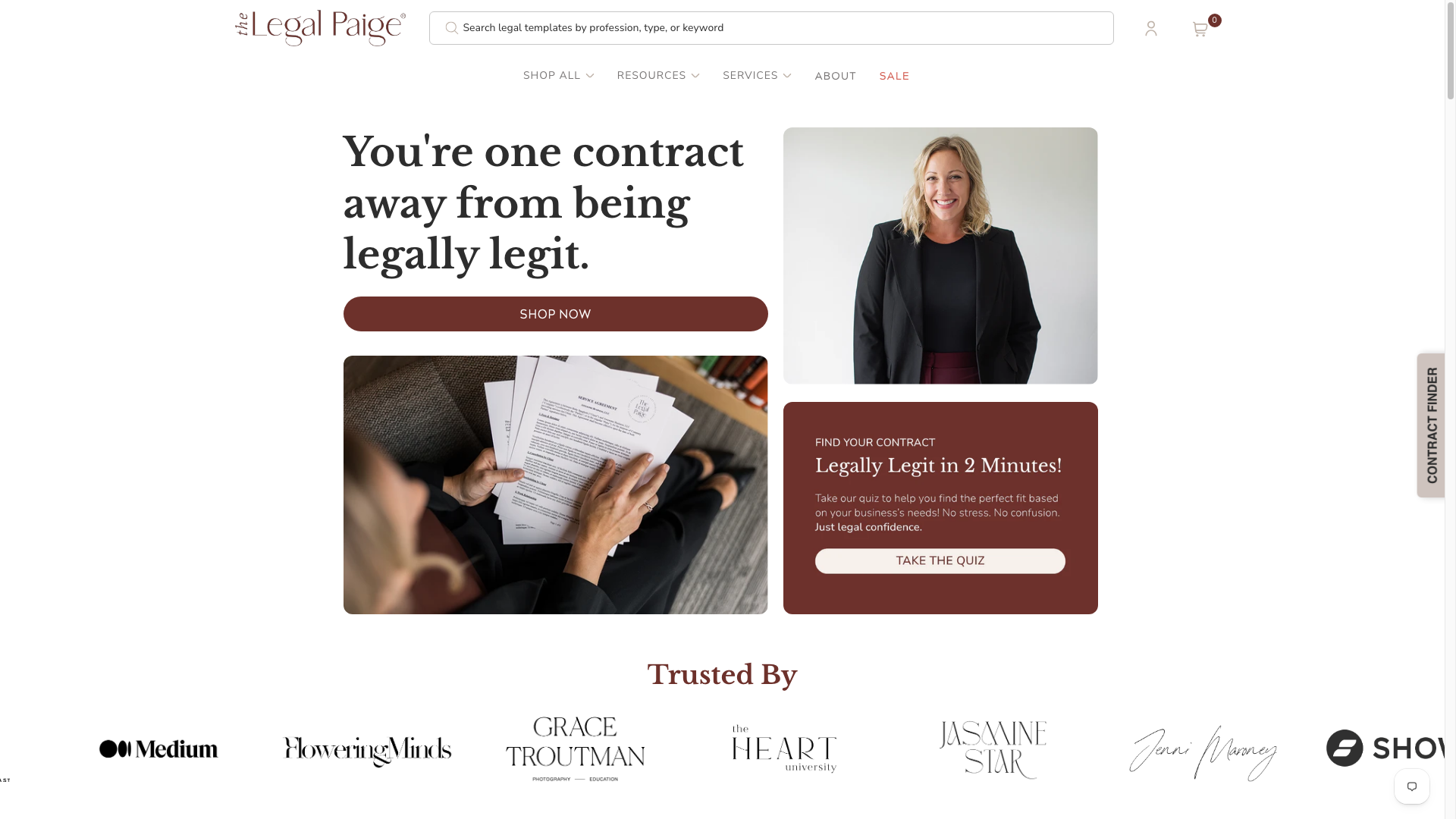 Original desktop storefront capture
Legal content can feel intimidating, while commerce-led product pages can feel transactional. The site had to bridge authority and warmth without oversimplifying the value of professional resources.
The project archive preserves the engagement type and shipped responsive storefront captures, but not private discovery files, analytics, staffing, duration, or vendor configuration. The observations below describe the documented scope and visible interface—not unpublished client metrics or research claims.
Professional-service shoppers need to understand the source’s authority and relevance before they can confidently evaluate a resource.
Helpful content and product navigation need to work together rather than compete for attention.
A composed visual language and plain, clear content hierarchy make a high-stakes category easier to approach.
The hierarchy was organised around make expert legal support feel approachable and easy to explore, with the brand story supporting—not competing with—the primary customer decision.
Warm neutrals, editorial portraits, structured serif typography, and calm card layouts create an expert-but-human point of view. The aim was a visual language that could flex across campaign, collection, and product moments without losing recognition.
The delivery focused on a responsive Shopify structure that keeps trust-building resource commerce usable as content, products, and seasonal priorities change.
Reviewed the supplied Figma direction, catalog priorities, and responsive states to identify the components and templates required for a faithful storefront implementation.
Mapped repeatable interface patterns into Shopify sections and templates so content and merchandising could stay structured as the catalog evolved.
Implemented the approved visual direction across desktop and mobile, preserving hierarchy while adapting navigation, media, and purchase paths to smaller screens.
Validated the finished storefront against the available design direction and live-path expectations. The archive does not include a dated launch log or post-launch change record.
The documented platform is Shopify. The engagement record also identifies Figma as the source design workflow. The live archive does not name the exact theme, app set, analytics implementation, hosting configuration, or external integrations, so they are intentionally not inferred here.
The page gives expert positioning and the founder’s perspective visible weight before asking visitors to choose a resource.
Structured content pathways help visitors move from a general legal concern toward relevant products or education.
Consistent cards and calls to action keep the path to a resource clear without undermining the site’s advisory tone.
Desktop Mobile
Warm neutrals, editorial portraits, structured serif typography, and calm card layouts create an expert-but-human point of view. Reusable navigation, promotional, collection, product, and action patterns create continuity across the storefront while allowing campaign content to retain its own energy.
Evidence-aware outcome
The verifiable outcome is a live, responsive Shopify storefront and the documented figma-to-shopify engagement. make expert legal support feel approachable and easy to explore is given a more deliberate interface path, and the original desktop and mobile captures demonstrate the delivered visual system. Conversion, revenue, engagement, accessibility, and performance metrics were not supplied for this archive and are therefore unavailable.
The project turns legal content can feel intimidating, while commerce-led product pages can feel transactional. the site had to bridge authority and warmth without oversimplifying the value of professional resources. into a storefront centred on trust-building resource commerce. It gives the brand a more coherent way to present its offer while giving customers a clearer path to continue, explore, or purchase.