Flavour is the browse model
The category works best when customers can understand the product through familiar flavour and occasion cues.
13 · Food & beverage
A colorful pantry-brand storefront built around clear flavor discovery and energetic merchandising.
A playful pantry merchandising that gives flavour-curious pantry shoppers and gift buyers a clearer route from brand story to the right next action.
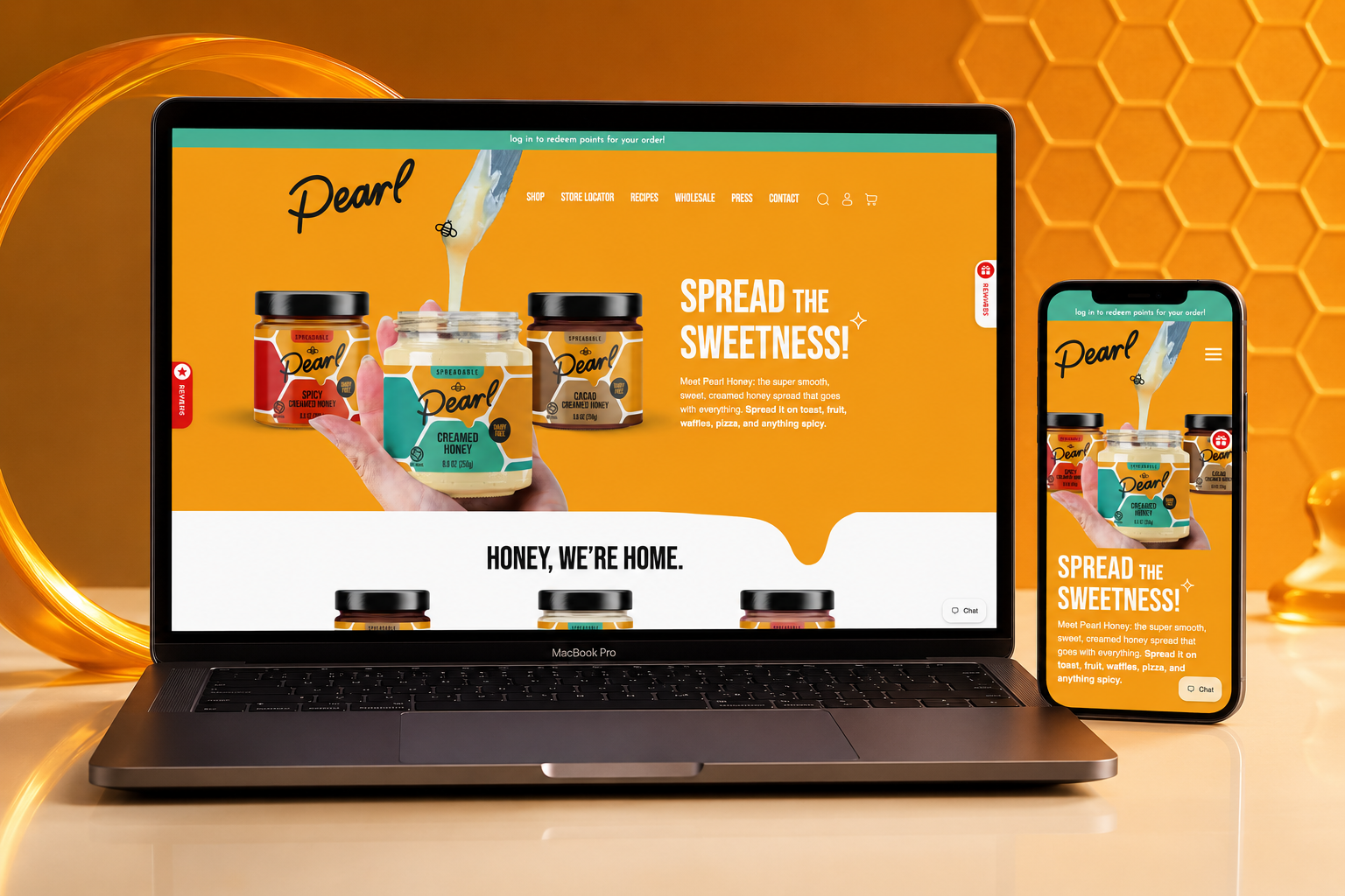
Pearl Honey Spreads turns flavoured honey into a playful pantry-brand experience. The storefront gives jars, flavours, and the brand’s sunny personality enough room to sell together. The website was shaped to make make flavour discovery feel joyful and easy to shop feel native to the brand rather than bolted onto it.
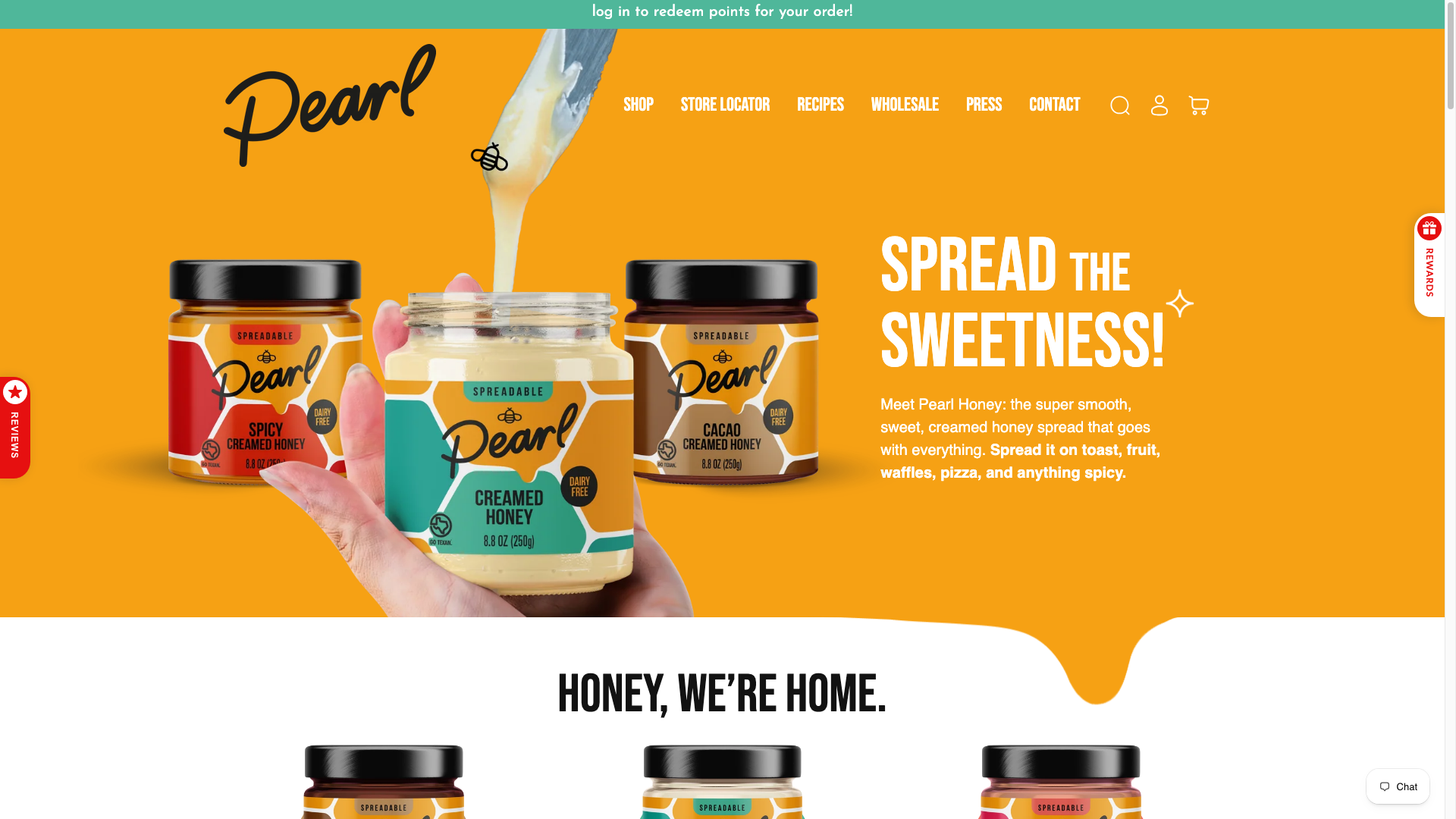 Original desktop storefront capture
A colourful food brand can feel fun without clearly explaining the product range. The site needed to use visual energy to invite exploration while keeping flavour and shopping decisions simple.
The project archive preserves the engagement type and shipped responsive storefront captures, but not private discovery files, analytics, staffing, duration, or vendor configuration. The observations below describe the documented scope and visible interface—not unpublished client metrics or research claims.
The category works best when customers can understand the product through familiar flavour and occasion cues.
The jar design becomes a useful visual anchor that makes each merchandising moment recognisable.
Playful shapes and vivid colour should still lead toward product, flavour, and purchase in a consistent sequence.
The hierarchy was organised around make flavour discovery feel joyful and easy to shop, with the brand story supporting—not competing with—the primary customer decision.
Honey gold, teal, glossy jar photography, drips, and soft rounded forms create an optimistic, sweet-but-polished visual world. The aim was a visual language that could flex across campaign, collection, and product moments without losing recognition.
The delivery focused on a responsive Shopify structure that keeps playful pantry merchandising usable as content, products, and seasonal priorities change.
Reviewed the supplied Figma direction, catalog priorities, and responsive states to identify the components and templates required for a faithful storefront implementation.
Mapped repeatable interface patterns into Shopify sections and templates so content and merchandising could stay structured as the catalog evolved.
Implemented the approved visual direction across desktop and mobile, preserving hierarchy while adapting navigation, media, and purchase paths to smaller screens.
Validated the finished storefront against the available design direction and live-path expectations. The archive does not include a dated launch log or post-launch change record.
The documented platform is Shopify. The engagement record also identifies Figma as the source design workflow. The live archive does not name the exact theme, app set, analytics implementation, hosting configuration, or external integrations, so they are intentionally not inferred here.
The storefront surfaces the spread range through clear product imagery and a warm, appetising first impression.
Brand graphics and product moments work together to make browsing feel lively without losing the category structure.
On mobile, product and flavour cues remain prominent as the desktop composition resolves into a focused vertical flow.
Desktop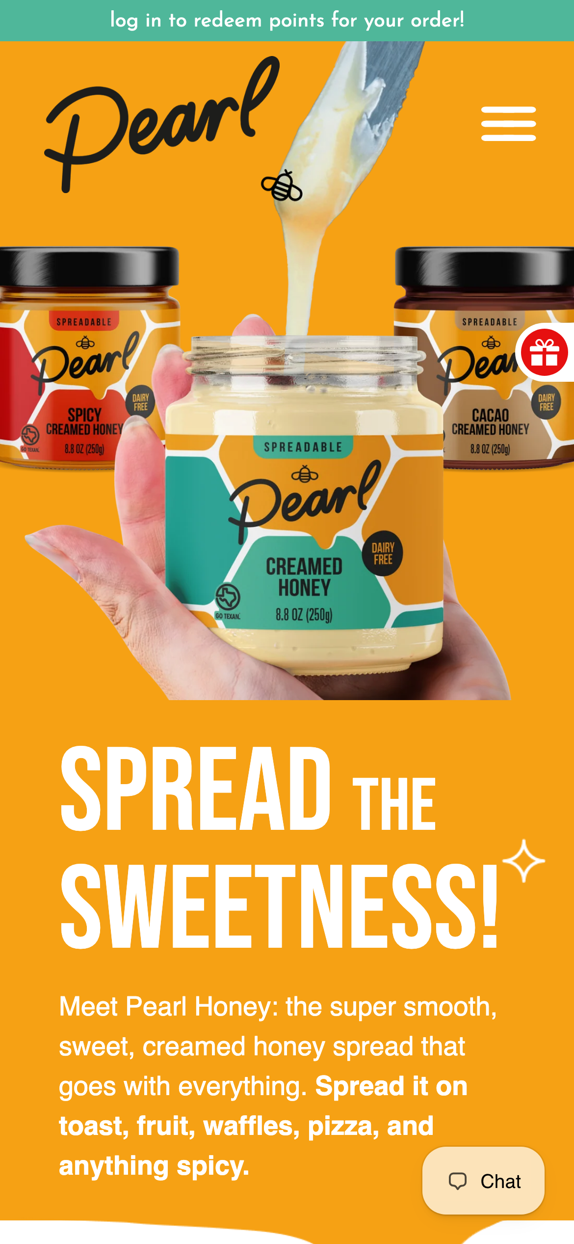 Mobile
Honey gold, teal, glossy jar photography, drips, and soft rounded forms create an optimistic, sweet-but-polished visual world. Reusable navigation, promotional, collection, product, and action patterns create continuity across the storefront while allowing campaign content to retain its own energy.
Evidence-aware outcome
The verifiable outcome is a live, responsive Shopify storefront and the documented figma-to-shopify engagement. make flavour discovery feel joyful and easy to shop is given a more deliberate interface path, and the original desktop and mobile captures demonstrate the delivered visual system. Conversion, revenue, engagement, accessibility, and performance metrics were not supplied for this archive and are therefore unavailable.
The project turns a colourful food brand can feel fun without clearly explaining the product range. the site needed to use visual energy to invite exploration while keeping flavour and shopping decisions simple. into a storefront centred on playful pantry merchandising. It gives the brand a more coherent way to present its offer while giving customers a clearer path to continue, explore, or purchase.