Choice needs gentle guidance
Coffee shoppers benefit from a clear starting point that lets them browse without requiring specialist knowledge.
15 · Coffee & beverage
A coffee storefront balancing product discovery, roast education, and subscription-ready shopping journeys.
A roast-led coffee commerce that gives coffee drinkers choosing beans, roasts, and gifts a clearer route from brand story to the right next action.
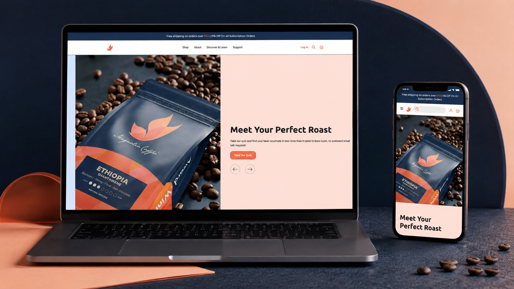
Magnolia Coffee Co. sells coffee through the familiar but highly choice-rich world of roast, flavour, and ritual. The storefront has to make product discovery feel welcoming for both knowledgeable coffee buyers and people simply looking for their next bag. The website was shaped to make make coffee selection feel approachable while supporting product discovery feel native to the brand rather than bolted onto it.
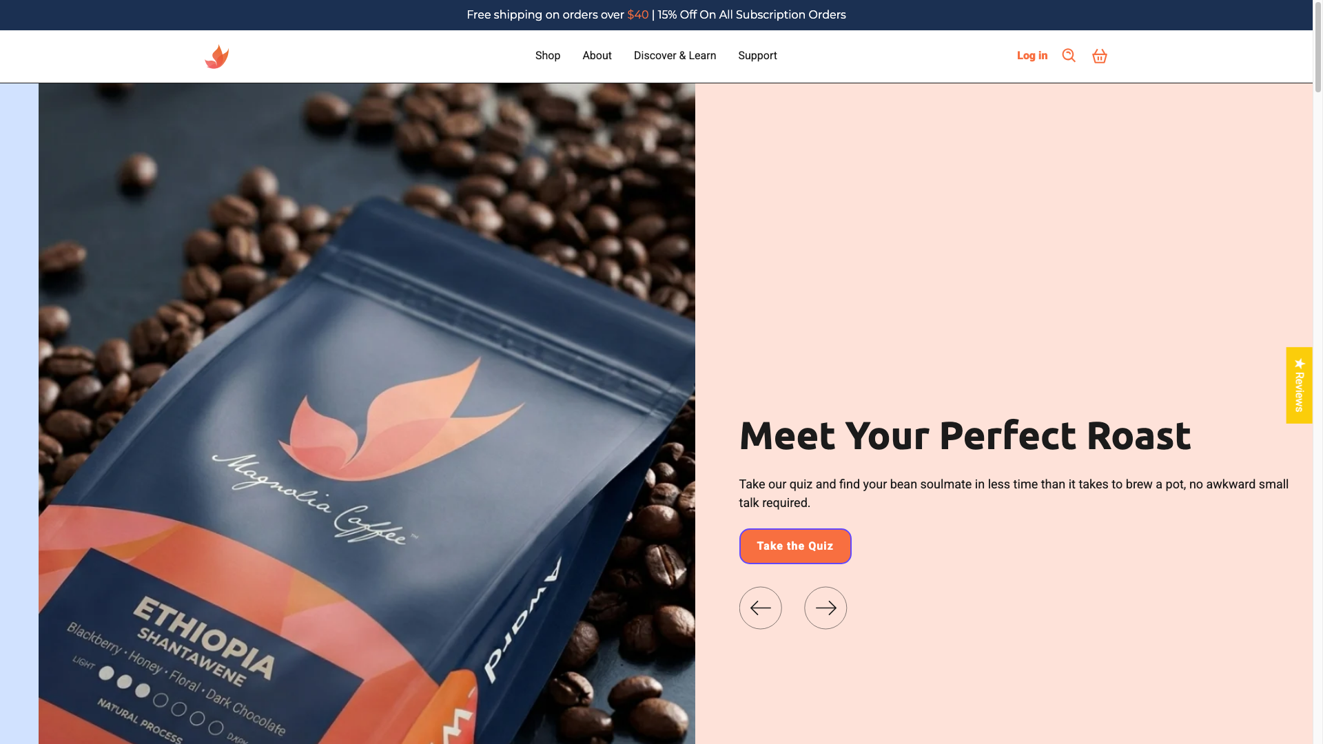 Original desktop storefront capture
Coffee carries a lot of product nuance—roast, taste, format, and ritual—without every shopper wanting a long lesson. The site needed to give the product enough context while keeping browsing warm and easy.
The project archive preserves the engagement type and shipped responsive storefront captures, but not private discovery files, analytics, staffing, duration, or vendor configuration. The observations below describe the documented scope and visible interface—not unpublished client metrics or research claims.
Coffee shoppers benefit from a clear starting point that lets them browse without requiring specialist knowledge.
Packaging and bean imagery should support the imaginative, ritual-led part of choosing coffee online.
Product discovery should feel fast enough for returning customers while retaining context for newcomers.
The hierarchy was organised around make coffee selection feel approachable while supporting product discovery, with the brand story supporting—not competing with—the primary customer decision.
Roast-toned neutrals, coffee bean photography, soft peach accents, and editorial product framing create a warm, considered café-to-home mood. The aim was a visual language that could flex across campaign, collection, and product moments without losing recognition.
The delivery focused on a responsive Shopify structure that keeps roast-led coffee commerce usable as content, products, and seasonal priorities change.
Reviewed the supplied Figma direction, catalog priorities, and responsive states to identify the components and templates required for a faithful storefront implementation.
Mapped repeatable interface patterns into Shopify sections and templates so content and merchandising could stay structured as the catalog evolved.
Implemented the approved visual direction across desktop and mobile, preserving hierarchy while adapting navigation, media, and purchase paths to smaller screens.
Validated the finished storefront against the available design direction and live-path expectations. The archive does not include a dated launch log or post-launch change record.
The documented platform is Shopify. The engagement record also identifies Figma as the source design workflow. The live archive does not name the exact theme, app set, analytics implementation, hosting configuration, or external integrations, so they are intentionally not inferred here.
The storefront keeps coffee products visually central while supporting shoppers who need more context before choosing.
Coffee imagery and restrained editorial layout make the brand feel considered without becoming overly formal.
Clear product actions and category cues keep the experience useful for both first-time and returning shoppers.
Desktop Mobile
Roast-toned neutrals, coffee bean photography, soft peach accents, and editorial product framing create a warm, considered café-to-home mood. Reusable navigation, promotional, collection, product, and action patterns create continuity across the storefront while allowing campaign content to retain its own energy.
Evidence-aware outcome
The verifiable outcome is a live, responsive Shopify storefront and the documented figma-to-shopify engagement. make coffee selection feel approachable while supporting product discovery is given a more deliberate interface path, and the original desktop and mobile captures demonstrate the delivered visual system. Conversion, revenue, engagement, accessibility, and performance metrics were not supplied for this archive and are therefore unavailable.
The project turns coffee carries a lot of product nuance—roast, taste, format, and ritual—without every shopper wanting a long lesson. the site needed to give the product enough context while keeping browsing warm and easy. into a storefront centred on roast-led coffee commerce. It gives the brand a more coherent way to present its offer while giving customers a clearer path to continue, explore, or purchase.