Seasonality drives entry
Newness and campaign storytelling need visible placements, but should resolve into recognisable shopping categories rather than isolated landing moments.
03 · Footwear & accessories
Editorial footwear commerce balancing seasonal campaigns, product discovery, and a high-volume catalog.
A editorial fashion retail that gives fashion-conscious footwear shoppers a clearer route from brand story to the right next action.
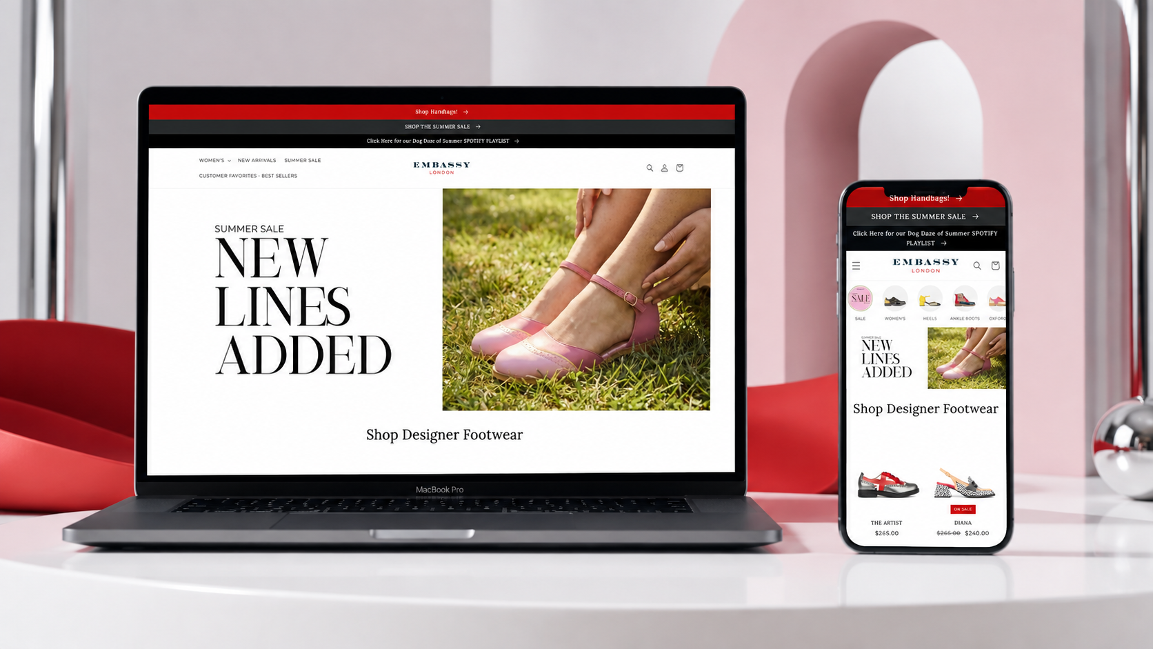
Embassy London presents designer footwear through a fashion-led lens. The storefront needed to give seasonal campaigns enough visual space while making a broad retail assortment easy to explore and shop. The website was shaped to make support seasonal storytelling while keeping catalog discovery efficient feel native to the brand rather than bolted onto it.
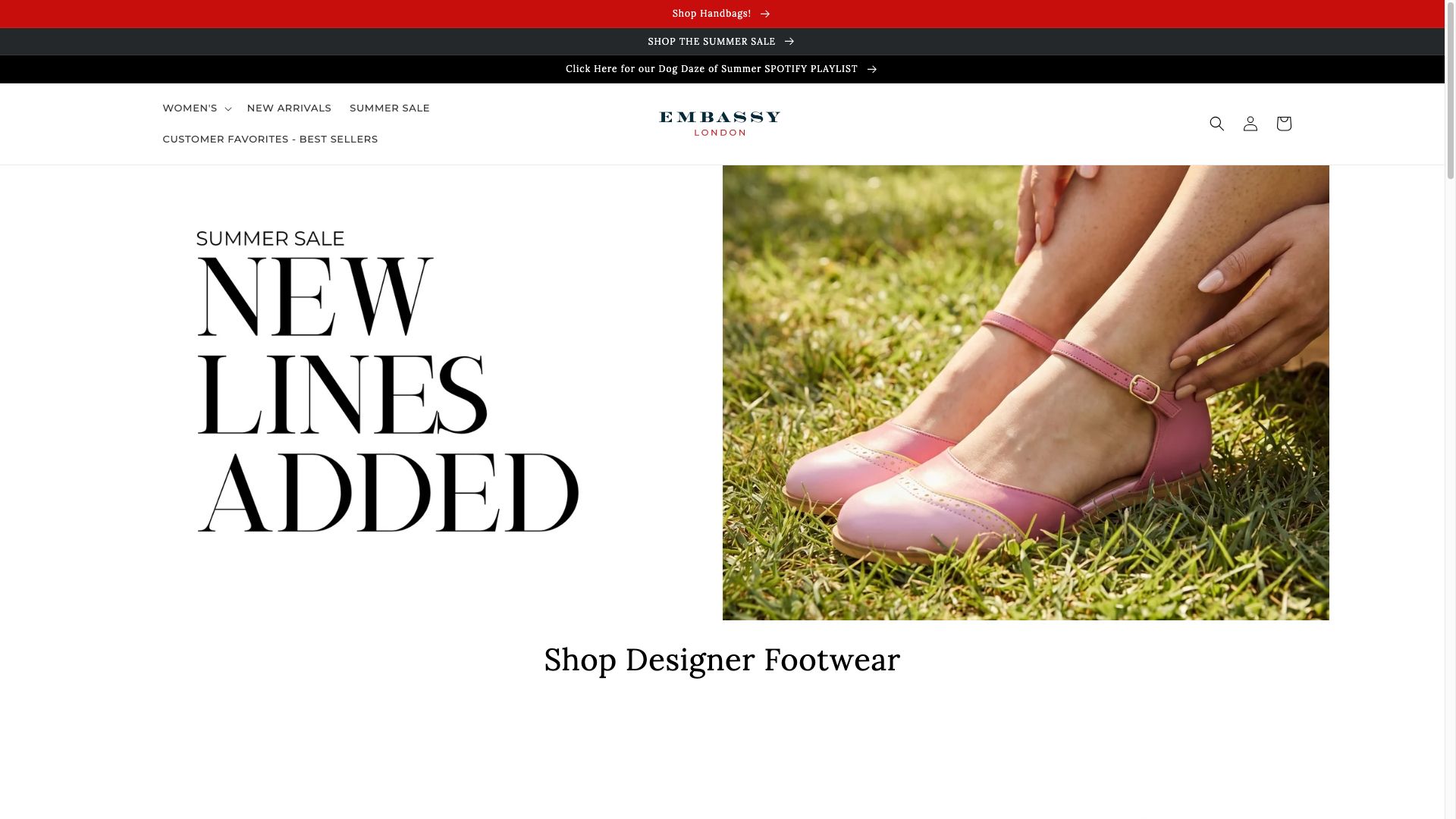 Original desktop storefront capture
Campaign imagery can make a footwear site feel desirable, but it cannot obscure navigation, category context, or product discovery. The design had to hold both editorial aspiration and a practical catalog in one system.
The project archive preserves the engagement type and shipped responsive storefront captures, but not private discovery files, analytics, staffing, duration, or vendor configuration. The observations below describe the documented scope and visible interface—not unpublished client metrics or research claims.
Newness and campaign storytelling need visible placements, but should resolve into recognisable shopping categories rather than isolated landing moments.
Footwear shoppers need fast orientation around category and product type, especially when the visual direction is intentionally editorial.
Large type and generous space can create fashion credibility when the core shopping actions remain consistent.
The hierarchy was organised around support seasonal storytelling while keeping catalog discovery efficient, with the brand story supporting—not competing with—the primary customer decision.
A red, white, and black palette with fashion photography and editorial-scale typography creates a polished department-store atmosphere. The aim was a visual language that could flex across campaign, collection, and product moments without losing recognition.
The delivery focused on a responsive Shopify structure that keeps editorial fashion retail usable as content, products, and seasonal priorities change.
Defined the storefront’s priority journeys, content hierarchy, and merchandising requirements from the available project brief and brand direction.
Turned the intended brand expression into a clear system of page modules, navigation patterns, and product-storytelling moments before implementation.
Built the storefront around reusable sections, product and collection templates, and responsive layouts suited to day-to-day merchandising.
Tested key viewport states and storefront paths before release. The archive does not preserve the private timeline, launch report, or post-launch optimisation log.
The documented platform is Shopify. The live archive does not name the exact theme, app set, analytics implementation, hosting configuration, or external integrations, so they are intentionally not inferred here.
Seasonal visual stories establish a clear mood and give shoppers a timely reason to explore the store.
The retail structure gives visitors a direct way to move from editorial context into footwear discovery.
The mobile layout preserves the campaign voice while condensing browsing decisions into a scan-friendly route.
Desktop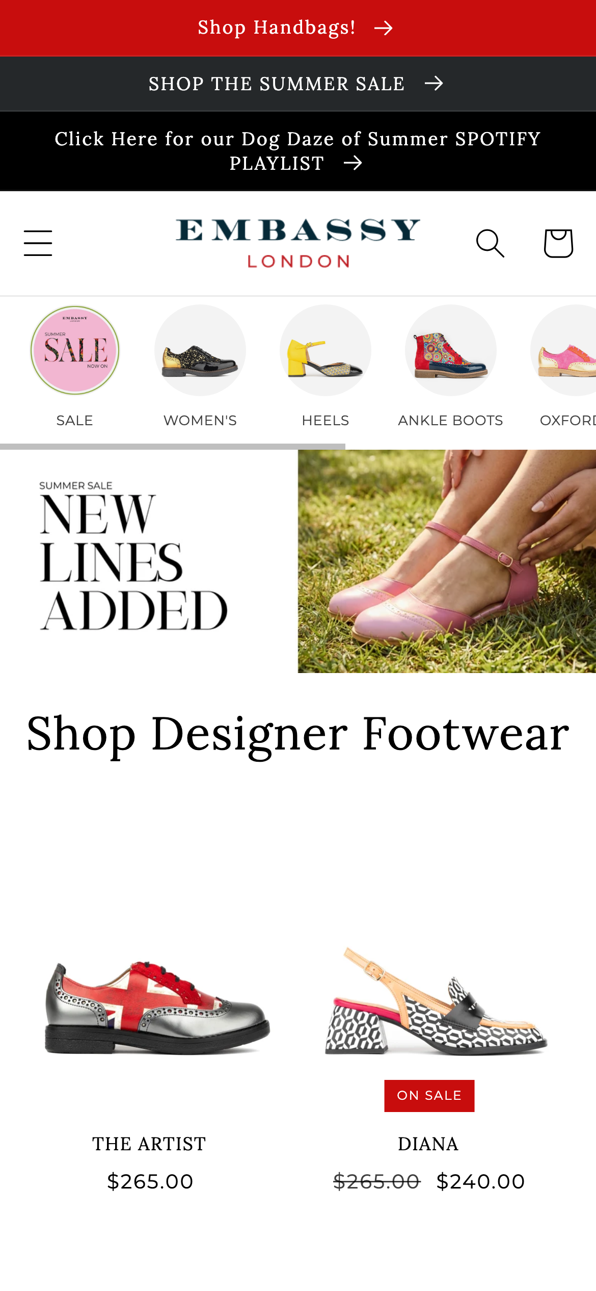 Mobile
A red, white, and black palette with fashion photography and editorial-scale typography creates a polished department-store atmosphere. Reusable navigation, promotional, collection, product, and action patterns create continuity across the storefront while allowing campaign content to retain its own energy.
Evidence-aware outcome
The verifiable outcome is a live, responsive Shopify storefront and the documented full shopify build engagement. support seasonal storytelling while keeping catalog discovery efficient is given a more deliberate interface path, and the original desktop and mobile captures demonstrate the delivered visual system. Conversion, revenue, engagement, accessibility, and performance metrics were not supplied for this archive and are therefore unavailable.
The project turns campaign imagery can make a footwear site feel desirable, but it cannot obscure navigation, category context, or product discovery. the design had to hold both editorial aspiration and a practical catalog in one system. into a storefront centred on editorial fashion retail. It gives the brand a more coherent way to present its offer while giving customers a clearer path to continue, explore, or purchase.