Parents need fast reassurance
The first impression should make the product category and its intended value easy to recognise, especially for visitors new to sensory play.
19 · Kids & learning
Targeted storefront improvements delivered around evolving client requirements and campaign needs.
A family-friendly sensory product browsing that gives parents and gift buyers looking for sensory play products a clearer route from brand story to the right next action.
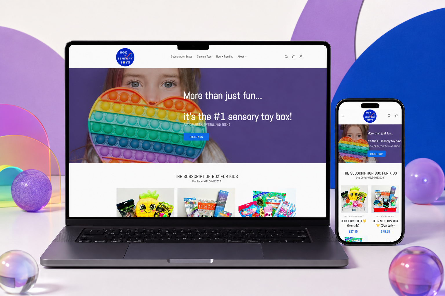
Box of Sensory Toys offers sensory-focused toy boxes for children and families. This engagement centred on targeted Shopify improvements that could support the brand’s evolving campaign and storefront needs without replacing the wider experience. The website was shaped to make support evolving campaign and storefront needs while preserving an approachable product journey feel native to the brand rather than bolted onto it.
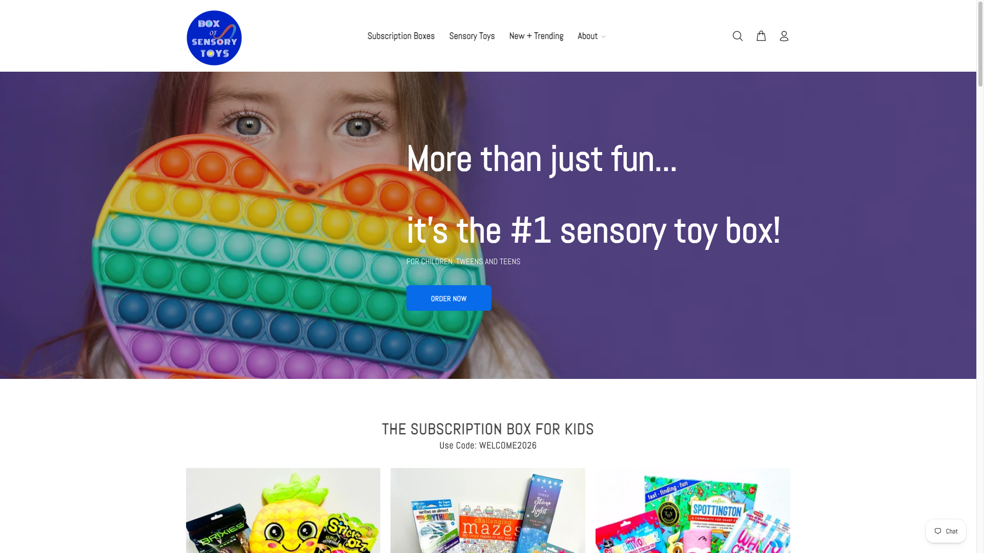 Original desktop storefront capture
Enhancement work requires care: new needs must be addressed without breaking existing content, subscription messaging, or a familiar shopping flow for parents. The updates had to fit the product’s playful world and the current theme structure.
The project archive preserves the engagement type and shipped responsive storefront captures, but not private discovery files, analytics, staffing, duration, or vendor configuration. The observations below describe the documented scope and visible interface—not unpublished client metrics or research claims.
The first impression should make the product category and its intended value easy to recognise, especially for visitors new to sensory play.
A recurring box proposition benefits from a straightforward explanation of what customers receive and why it is relevant.
Changes should reinforce existing customer expectations rather than forcing a new navigation or brand model onto an established store.
The hierarchy was organised around support evolving campaign and storefront needs while preserving an approachable product journey, with the brand story supporting—not competing with—the primary customer decision.
Playful purple, colourful sensory-toy imagery, soft translucent shapes, and a family-friendly composition reinforce the product’s imaginative purpose. The aim was a visual language that could flex across campaign, collection, and product moments without losing recognition.
The delivery focused on a responsive Shopify structure that keeps family-friendly sensory product browsing usable as content, products, and seasonal priorities change.
Translated the evolving client requirements into a focused change list, prioritising the customer-facing paths most likely to be affected.
Worked within the current storefront structure, identifying where updates could extend the theme without destabilising established commerce flows.
Delivered the requested content, theme, and responsive refinements while keeping the experience consistent with the existing brand system.
Checked the updated states across relevant breakpoints and key paths. The archive does not include a dated release calendar or post-launch metric report.
The documented platform is Shopify. The live archive does not name the exact theme, app set, analytics implementation, hosting configuration, or external integrations, so they are intentionally not inferred here.
Updates extend the existing storefront around active campaign and client needs without changing its core identity.
Colourful imagery and concise content help communicate the family-focused subscription product at a glance.
The experience continues to hold its friendly product and action hierarchy across desktop and mobile captures.
Desktop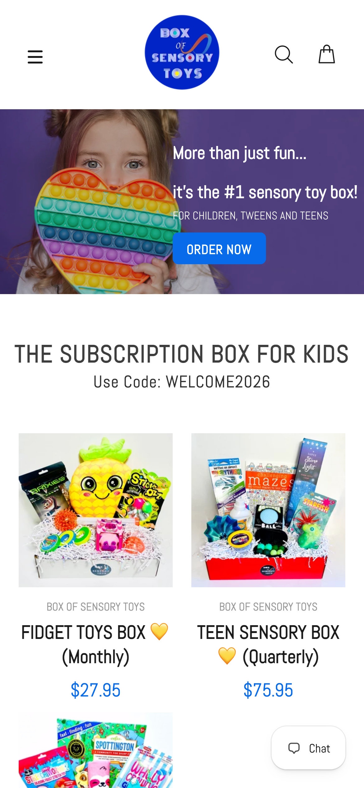 Mobile
Playful purple, colourful sensory-toy imagery, soft translucent shapes, and a family-friendly composition reinforce the product’s imaginative purpose. Reusable navigation, promotional, collection, product, and action patterns create continuity across the storefront while allowing campaign content to retain its own energy.
Evidence-aware outcome
The verifiable outcome is a live, responsive Shopify storefront and the documented client enhancements engagement. support evolving campaign and storefront needs while preserving an approachable product journey is given a more deliberate interface path, and the original desktop and mobile captures demonstrate the delivered visual system. Conversion, revenue, engagement, accessibility, and performance metrics were not supplied for this archive and are therefore unavailable.
The project turns enhancement work requires care: new needs must be addressed without breaking existing content, subscription messaging, or a familiar shopping flow for parents. the updates had to fit the product’s playful world and the current theme structure. into a storefront centred on family-friendly sensory product browsing. It gives the brand a more coherent way to present its offer while giving customers a clearer path to continue, explore, or purchase.